Thomas Pedot
mardi 14 avril 2026
Rebuilding GitAlchemy's UI with a Raycast-Inspired Design System
GitAlchemy's original UI was functional but generic — a standard mobile app look that blended into every other React Native GitLab client. The redesign brings a distinct Raycast-inspired aesthetic: dark-only, crisp typography, refined spacing, and a unified surface token system. This article documents the design decisions and implementation.
Design Philosophy
Raycast set a new standard for developer tools: consistent dark backgrounds, subtle borders, Inter font with tabular figures, and tight component spacing. Mobile apps rarely achieve this level of polish. The goal was to bring that "pro app" feel to a mobile GitLab client:
- Dark-only — eliminates theme switching complexity, ensures consistent color perception
- Surface-based hierarchy — layered backgrounds rather than flat color changes
- Typography-first — Inter variable with OpenType features (ss03 for slashed zero, tabular nums)
- Touch-optimized — 44pt minimum touch targets, generous tap areas on lists
The Surface Token System
The design uses a three-level surface hierarchy, implemented as Tailwind CSS custom colors:
1// tailwind.config.ts theme extension
2colors: {
3  surface: {
4    card: '#1e1f23',      // Primary surface — cards, list items
5    secondary: '#2a2b2f', // Elevated surface — modals, dropdowns
6    border: '#3a3d40',     // Subtle borders between surfaces
7  },
8  foreground: {
9    primary: '#ffffff',
10    secondary: '#a1a1aa',
11    muted: '#71717a',
12  },
13  accent: {
14    blue: '#3b82f6',
15    green: '#22c55e',
16    orange: '#f97316',
17    red: '#ef4444',
18  }
19}
The hierarchy works by layering: surface.card is the base, surface.secondary sits on top for modals, and surface.border provides separation. This creates depth without shadows — mobile screens don't have ambient light to cast shadows, so borders are more honest.
Typography: Inter Variable
The font choice is Inter variable, loaded with specific OpenType features:
1/* Global CSS */
2@font-source-inter {
3  font-feature-settings: 'ss01', 'ss03', 'cv11', 'zero';
4}
5
6body {
7  font-family: 'Inter Variable', sans-serif;
8  -webkit-font-smoothing: antialiased;
9  -moz-osx-font-smoothing: grayscale;
10}- ss01 — switched-style glyphs for a more geometric appearance
- ss03 — slashed zero for clear distinction between 0 and O in code
- cv11 — raised minus for better math rendering
- zero — tabular figures for number alignment in data tables
The variable font axis means we get the full weight range (100-900) without multiple font files — critical for mobile bandwidth.
Component Overhaul
List Items
Every list item (projects, issues, MRs, todos) was redesigned with consistent structure:
1function ProjectCard({ project }: { project: Project }) {
2  return (
3    <div className="bg-surface-card border border-surface-border rounded-lg p-4">
4      <div className="flex items-center gap-3">
5        <Avatar src={project.avatar_url} />
6        <div className="flex-1 min-w-0">
7          <Text variant="foreground.primary" weight="medium" truncate>
8            {project.name}
9          </Text>
10          <Text variant="foreground.secondary" size="sm">
11            {project.path_with_namespace}
12          </Text>
13        </div>
14        <ChevronRight className="text-foreground-muted" />
15      </div>
16    </div>
17  );
18}
The pattern is consistent: icon/avatar → title + subtitle → trailing action. Every card follows this template.
Comment Threads
Merge request and issue comments were rebuilt for richer content:
- Thread structure — comments grouped by conversation, with collapsible replies
- Rich text — TipTap editor for multi-line comments with markdown preview
- Action bar — reply, resolve, reaction buttons below each comment
The TipTap integration was non-trivial on mobile. We needed:
1const editor = useEditor({
2  extensions: [
3    StarterKit,
4    Placeholder.configure({ placeholder: 'Write a comment...' }),
5    Link.configure({ openOnClick: false }),
6  ],
7  editorProps: {
8    attributes: {
9      class: 'prose prose-invert prose-sm focus:outline-none min-h-[100px]',
10    },
11  },
12});
The prose-invert class from @tailwindcss/typography handles dark mode automatically.
Navigation
The mobile navigation uses a bottom tab bar with 4 primary destinations:
1function MobileNav() {
2  return (
3    <nav className="fixed bottom-0 left-0 right-0 bg-surface-card border-t border-surface-border">
4      <div className="flex justify-around items-center h-16">
5        <NavItem icon={HomeIcon} label="Home" to="/" />
6        <NavItem icon={ProjectsIcon} label="Projects" to="/projects" />
7        <NavItem icon={TodosIcon} label="Todos" to="/todos" />
8        <NavItem icon={ProfileIcon} label="Profile" to="/profile" />
9      </div>
10    </nav>
11  );
12}
Each NavItem shows the active state with the accent color and maintains the 44pt touch target.
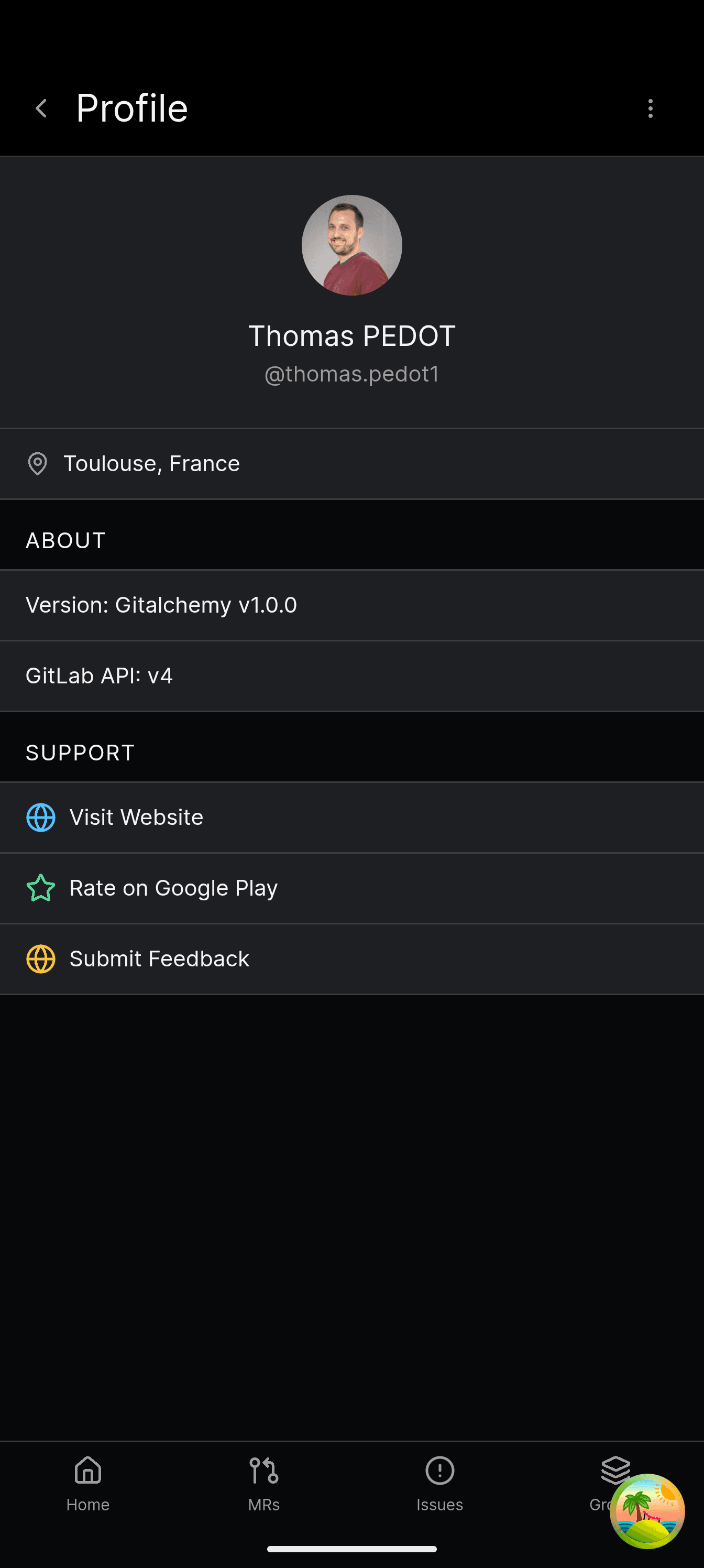
Result
The redesign shipped with GitAlchemy 1.3. The screenshots in the main article show the final result: a cohesive dark interface that feels like a desktop developer tool, not a generic mobile app.
Key metrics:
- Perceived quality — user reviews mention "finally a pro-looking GitLab client"
- Consistency — 47 components now share the same design tokens
- Performance — Inter variable loads single 40KB file vs 6 weights × 2 styles = 12 files
Related Articles
- TipTap Mobile Editor Implementation — The rich text editor built on this design system
- WorkManager Background Tasks — Android background sync with notifications
- Tauri Android F-Droid Distribution — Getting the app to users
- GitAlchemy Rust + Vite Stack — Full stack architecture